
Continuing with our Analytics team study of the virus on Western European countries, we present our findings for data up to week 15 (14 April).
As discussed in our previous articles, in order to provide an objective comparison per country, the algorithmic results need to be standardised around the population of each country in order to produce a more accurate deaths per million inhabitants rate. The figure shown below summarises the results.
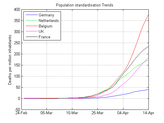
As seen, Belgium’s mortality rate (red) is significantly higher than any of its neighbours. Germany (blue) and the Netherlands (green) have the lowest mortality rates, and appear to be levelling off. This suggests that the Dutch and German governments testing, health care systems and social distancing strategies appear to be paying off.
It’s not completely clear why Belgium’s mortality rate is so much higher than its neighbours, but a possible explanation may be due to insufficient testing and the virus hitting various elderly care homes. We’ll follow Belgium’s progress over the coming weeks, and report our findings.
The UK
As discussed in a previous article, the UK had a one-week head start on its neighbours. Therefore, shifting the UK data left by six days, we obtain an interesting picture of the UK’s situation:
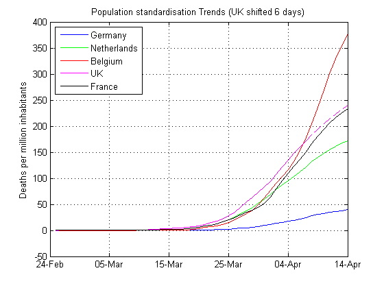
Applying a prediction model to the UK data (dashed magenta line), notice how the UK’s data follows France’s data. Although long term predication models should be viewed with a degree of scepticism (as there are too many unknown factors to consider), the prediction suggests that the UK’s mortality rate should follow France’s mortality rate.
The good news for the UK population, is that the emergency measures in place, appear to be working and are leading to a decline in deaths!


Leave a Reply
Want to join the discussion?Feel free to contribute!